


 Ajax
Ajax Beans
Beans Callbacks
 Components
 Events
 Exceptions
 Faces
Faces Facelets
 JSON
JSON Hacks
Hacks State
State  JNDI
JNDI Platform
 Utils
Utils Messages
 MapWrapper
 Reflection
 Renderers
 ResourcePaths
 XML
XML Servlets
 Arrays
 Converters
 Dates
Dates Numbers
 Objects
 Strings
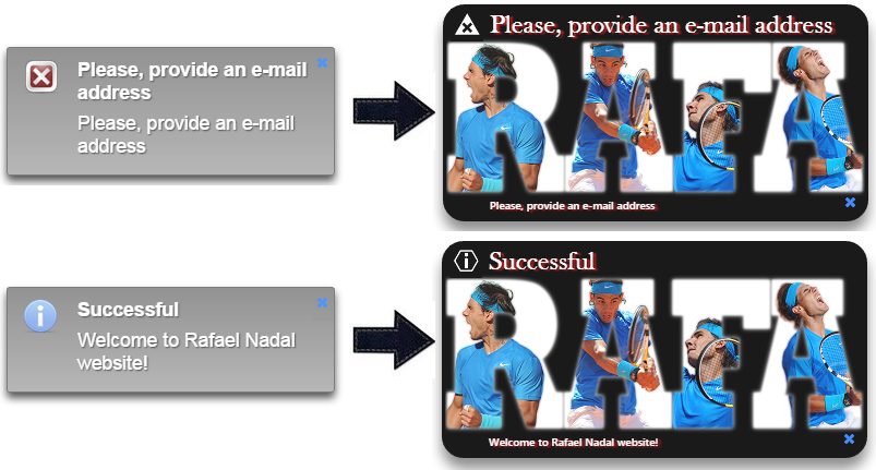
In this
post, you will see which are the PrimeFaces 5.1 CSS built-in classes that should
be overridden to obtain a custom look for a PrimeFaces Growl component. So,
the main idea is to begin with something like in figure below, left side (a
default styled PrimeFaces 5.1 Growl component), and to finish with
something like in figure below, right side (custom styled):
The
PrimeFaces Growl
documentation is helping us to achieve this task by providing the names of the
CSS built-in classes that we can modify for obtaining a custom look . But, this
not is quite easy to achieve in a short period of time, especially if you want
to implement major changes. So, based on PrimeFaces documentation, and on Mozilla
Firebug tools ( especially on Inspector Tool) I tried to obtain a custom look
for a PrimeFaces Growl component that can serve as source of inspiration
in your projects.
So, first
let's "cut" from Firebug the relevant part and expose it in a figure
(you can follow this technique for any other PrimeFaces component):

Now, let's
see what we can achieve in the highlighted classes:
ui-growl
The ui-growl
is the class attached to the main <div>
that contains Growls.
This is the proper place to set the width, and the top and right margins
relative to window, for this <div>. For example, if you want to
place the Growls
at 5 pixels from the top and right and have a width of 384 pixels, then you can
write this:
/* Growl
main div - control over: position, width, top, right, etc*/
.ui-growl {
position: fixed;
right: 5px;
top: 5px;
width: 384px;
}

Originally,
had this:
.ui-growl {
position: fixed;
right: 20px;
top: 20px;
width: 301px;
}
ui-growl-item-container
This class
is attached to a <div> nested in the main <div> (let's name it, container <div>). It has a relative position to the main <div> and it is very
useful for setting the opacity and margin of Growls (of course, you can
add here any styles that affects the entire container). For example, if you
override this class only, and specify an opacity of 0.4, then your Growls
will look like below:
/* Growl
container - control over: opacity, background color, etc */
.ui-growl-item-container
{
position: relative;
opacity: 0.4;
}

Originally,
had this:
.ui-growl-item-container
{
margin: 0 0 10px;
opacity: 0.85;
position: relative;
}
ui-state-highlight
This class
is attached to the container <div>
also. I prefer to place here the styles for border and background color, gradient
or background image (you also can set here the text color). For example:
/* Growl
control over: border, background gradient/image, color, etc */
.ui-state-highlight{
border: 3px solid #000000;
border-radius: 20px;
background-color: #3B5998;
}

/* Growl
control over: border, background gradient/image, color, etc */
.ui-state-highlight{
border: 3px solid #000000;
border-radius: 20px;
background: -moz-linear-gradient(center top ,
rgba(120, 20, 330, 1), rgba(10, 255, 5,
0.5)) repeat scroll 0 0 #00cc00;
}

We will use
an image as background, so the CSS will be:
/* Growl
control over: border, background gradient/image, color, etc */
.ui-state-highlight{
border: 3px solid #000000;
border-radius: 20px;
background-image:
url('#{resource["default:images/rafabg.png"]}');
}

Originally,
had this:
.ui-state-highlight
{
background: -moz-linear-gradient(center top ,
rgba(0, 0, 0, 0.25), rgba(0, 0, 0, 0)) repeat scroll 0 0 #aaaaaa;
border: 1px solid #666666;
color: #ffffff;
text-shadow: 1px 1px 1px #333333;
}
Note For
obtaining round corners, PrimeFaces uses the below CSS class:
.ui-corner-all
{
border-radius: 3px;
}
But, as its
name suggest, this class affects the corners of other PrimeFaces components
also (e.g. <p:commandButton>,
<p:inputText>,
etc). So, this is why I prefer to use border-radius in ui-state-highlight.
ui-shadow
This class
is attached to the container <div>
also, and this is the proper place to indicate the container shadow. For
example:
/* Growl
control over container shadow */
.ui-shadow {
box-shadow: 10px 15px 15px rgba(22, 255, 124,
0.5);
}
Originally,
had this:
.ui-shadow {
box-shadow: 0 5px 10px rgba(0, 0, 0, 0.8);
}
ui-growl-item
This class
is attached to a <div> nested in the container <div> (let's name it, the item <div>). It contains the close icon, the image
representing the type of message (error, info, fatal, warning) and the message
itself (summary and detail). So, here we can style the padding, margins,
display, etc. For example, if you need a padding top of 1 pixel and padding
right of 4 pixels, then you can write this:
.ui-growl-item
{
display: block;
padding: 1px 4px;
}
Originally,
had this:
.ui-growl-item
{
display: block;
padding: 10px 15px;
}
ui-growl-image
This class
is attached to a <div> nested in the item <div>. From here we can
easily modify the size and position of the Growl image (fatal, info, error or warning)
in the item <div>. For example:
.ui-growl-image
{
height:
30px;
width: 30px;
}
Originally,
had the below code. Notice that the image (fatal, info, warning or error) is
set as via the background
element. PrimeFaces uses a an image sprite named, messages.png. But, if we
want to indicate our own images, then we can simply override the next CSS
classes.
.ui-growl-image
{
background:
url("/StylingPrimeFacesGrowl/faces/javax.faces.resource/messages/messages.png?ln=primefaces&v=5.1")
no-repeat scroll 0 0 rgba(0, 0, 0, 0);
display: block;
float: left;
height: 32px;
margin: 0;
padding: 0;
width: 32px;
}
ui-growl-image-* (* - error, info, fatal, warn)
These
classes allows us to easy replace the original images:
.ui-growl-image-error{
background:
url('#{resource["default:images/error.png"]}');
}
.ui-growl-image-fatal{
background:
url('#{resource["default:images/fatal.png"]}');
}
.ui-growl-image-info{
background:
url('#{resource["default:images/info.png"]}');
}
.ui-growl-image-warn{
background:
url('#{resource["default:images/warn.png"]}');
}
Originally,
had this:
.ui-growl-image-error
{
background-position: 0 0;
}

ui-growl-icon-close
Via this
class we can alter the position and cursor for the close icon. For example, I have move it from the top-right corner, to
down-right corner:
.ui-growl-icon-close
{
position: absolute;
right: 6px;
top: 170px;
}
Originally,
had this:
.ui-growl-icon-close
{
cursor: pointer;
position: absolute;
right: 3px;
top: 5px;
}
ui-growl-message
This class
is attached to the <div> that encapsulates the message (summary and
detail). So, we can modify here the position, width, height, etc:
.ui-growl-message{
width:340px;
}
Originally,
had this:
.ui-growl-message
{
float: right;
padding: 0 0 5px;
width: 220px;
}
ui-growl-title
This class
add style to the message summary. Here, we can easily adjust font, text color
and shadow, etc. For example:
.ui-growl-title
{
display: block;
color:#ffffff;
text-shadow: 3px 1px 1px #cc0000;
font-family:
Baskerville, 'Baskerville Old Face', 'Hoefler Text', Garamond, 'Times New
Roman', serif;
font-size: 24px;
font-style: normal;
font-variant: normal;
font-weight: 500;
line-height: 26.3999996185303px;
padding: 2px 0px 5px;
}

Originally,
had this:
.ui-growl-title
{
display: block;
font-weight: bold;
padding: 0 0 7px;
}
.ui-growl-message p
This class
add style to the message detail. Here, we can easily adjust font, text color
and shadow, etc. For example:
.ui-growl-message
p {
color:#ffffff;
text-shadow: 3px 1px 1px #cc0000;
font-family: 'Segoe UI', Frutiger, 'Frutiger
Linotype', 'Dejavu Sans', 'Helvetica Neue', Arial, sans-serif;
font-size: 10px;
font-style: normal;
font-variant: normal;
font-weight: 500;
line-height: 15.3999996185303px;
padding-top:140px;
}

Originally,
had this:
.ui-growl-message
p {
font-weight: normal;
}
Done! Now,
you can put these CSS classes in a single file, and obtain this (there are a few irrelevant modifications):
/* Growl
main div - control over: position, width, top, right, etc*/
.ui-growl {
position: fixed;
right: 5px;
top: 5px;
width: 384px;
}
/* Growl
container - control over: opacity, margin, etc */
.ui-growl-item-container
{
position: relative;
opacity: 0.9;
}
/* Growl
control over: border, background gradient/image, color, etc */
.ui-state-highlight{
border: 3px solid #000000;
border-radius: 20px;
background-image:
url('#{resource["default:images/rafabg.png"]}');
/* or, you can use a color
background-color: #3B5998;
*/
/* or, you can use a gradient
background: -moz-linear-gradient(center top ,
rgba(120, 20, 330, 1), rgba(10, 255, 5, 0.5)) repeat scroll 0 0 #00cc00;
*/
}
/* Growl
control over container shadow */
.ui-shadow {
box-shadow: 0 10px 17px rgba(0, 0, 0, 0.5);
}
/* Growl div
that contains the close icon, image for message type and message (summary and
detail) */
.ui-growl-item
{
display: block;
padding: 1px 4px;
}
/* Define
image properties (error, fatal, warning and info images) */
.ui-growl-image
{
height: 30px;
width: 30px;
}
/* Define an
image for each type (error, fatal, info and warning) */
.ui-growl-image-error{
background: url('#{resource["default:images/error.png"]}');
}
.ui-growl-image-fatal{
background:
url('#{resource["default:images/fatal.png"]}');
}
.ui-growl-image-info{
background:
url('#{resource["default:images/info.png"]}');
}
.ui-growl-image-warn{
background: url('#{resource["default:images/warn.png"]}');
}
/* Customize
the icon close position */
.ui-growl-icon-close
{
position: absolute;
right: 6px;
top: 170px;
}
/* Growl div
that contains the message (summary and detail)*/
.ui-growl-message{
width:340px;
}
/* Growl
title - this is the message summary*/
.ui-growl-title
{
color:#ffffff;
text-shadow: 3px 1px 1px #cc0000;
display: block;
font-family: Baskerville, 'Baskerville Old
Face', 'Hoefler Text', Garamond, 'Times New Roman', serif;
font-size: 24px;
font-style: normal;
font-variant: normal;
font-weight: 500;
line-height: 26.3999996185303px;
padding: 2px 0px 5px;
}
/* Growl
message - this is the message detail*/
.ui-growl-message
p {
color:#ffffff;
text-shadow: 3px 1px 1px #cc0000;
font-family: 'Segoe UI', Frutiger, 'Frutiger
Linotype', 'Dejavu Sans', 'Helvetica Neue', Arial, sans-serif;
font-size: 10px;
font-style: normal;
font-variant: normal;
font-weight: 500;
line-height: 15.3999996185303px;
padding-top:140px;
}
In the
below, figure you can see these classes (and a few more) and the divs
they style:

Note The CSS rules are pretty flexible, so you can play with this example to obtain the best solution for your case. Most probably, you will not need to override all these classes, so you will "condense" and rearrange the styles in your "style".
Complete
code on GitHub.
 <h:inputText/>
  ZEEF JSF Beginner's Guide
  JSF 2 Tutorials at www.mkyong.com
  JavaServer Faces (JSF) Tutorial


 Postări


Niciun comentariu :
Trimiteți un comentariu